Brand Spanking New Look and Feel - The Monthly

Its getting there guys!!
So as you may notice, this is my first proper dev log for this game. I'm going to try and make a proper dev log every so often and just talk about what on earth I've been up to with the game. Mostly for my own sanity so I can note my progress.
I'm not too sure on the structure, it will probably be me just rambling. So, I guess, lets start then!
Art direction
This has probably been the hardest part of development for me, but actually (and definitely surprisingly) the most satisfying. The game started off pretty basic looking. It had the standard asset flip itch assets, and looked something like this:
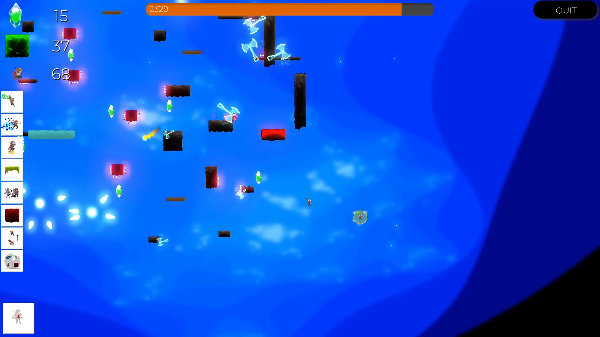
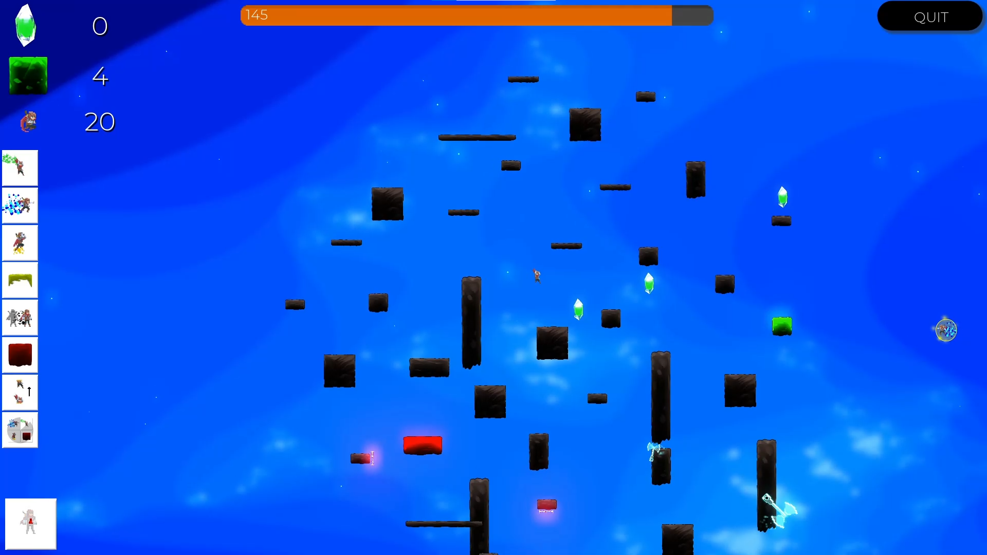
Now don't get me wrong, I liked the direction it was going in. The gameplay was pretty much there, and it had a light and airy feel about it, both in how it played, and how it looked. However, except for a few bits and pieces I added, the art was basically straight from the front page of itch.
So, I did some reading on use of colours in games, looked at existing games and how they managed to find an art style, and did every YouTube graphic design and game asset tutorial I could find (one of my favourites was this):
And what did I come too? Introducing the next major look of Escape the Ether!
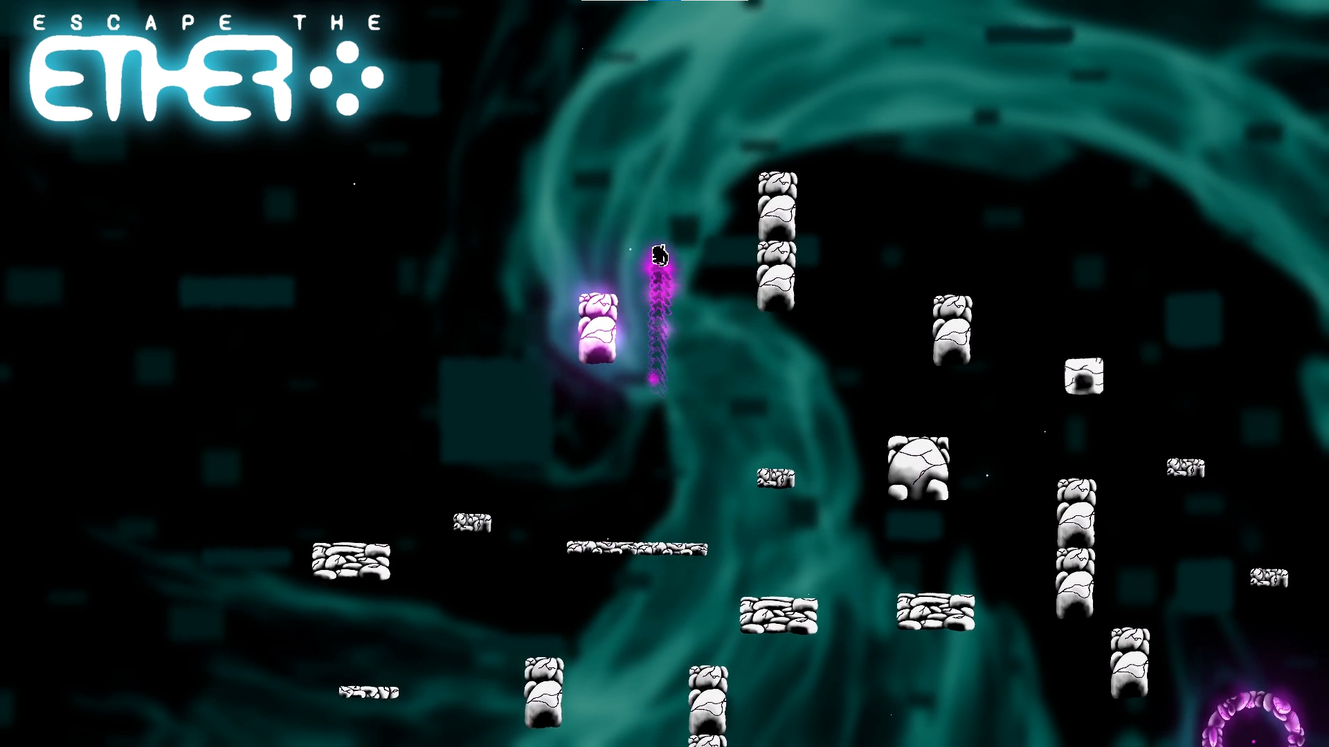

Yep, I hated it too.
But let me explain some more. I had an idea that I wanted it to look a little like Urdak from Doom eternal, thus the colour scheme. I liked how the colours for important things (red for enemies, purple for player magic) stood out. And I still like the colour scheme and the platforms. So why did I hate it?
Well, it had lost the only thing I liked about the assets flip style I previously had. It wasn't light and airy anymore. Side note, the background is actually a 3D blender volumetric procedurally generated nebula. No idea why I did that.
And honestly, looking at allot of indie games, I think allot of people have this problem. Polish these days seems to be about making everything dark so key things stand out and look amazing. And I’m not throwing shade, it works for lots of games. But I knew it wasn’t right for mine.
So I went away and had another go. I found the lightest, airiest colour palette I could find, and forced myself to make it work. And so, let me introduce the third and current iteration:

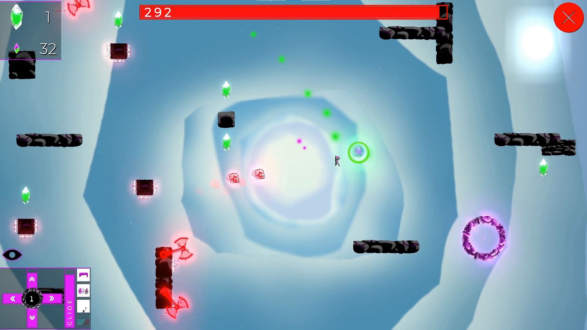
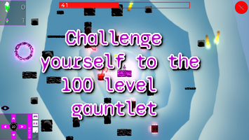
Honestly, I know its not perfect, but I do like it. Its all my own doing, it has nice depth, and its like and airy, while still allowing the important things to stand out (mostly). It also has a much more consistent UI art style, which is nice. It will probably change again, but for now, I’m taking the art hat off and putting it to one side again, until I get another morsel of inspiration that leads me to change everything once again!
Music
I played guitar for many years when I was younger. I’ve always been into music, especially game OST’s, and so one would expect the music side to come naturally to me. Nope. Not even close. For reference, check the soundtrack I made for a game I made for kids to play in hospital waiting rooms for the NHS:
It is catchy (ish), but its also super annoying. I put off making music for this game until literally the last minute. I had everything ready to go for a new demo, showcasing the new art style and some gameplay improvements, found myself home alone for the day, and forced myself to crack open LMMS.
Previously I had started by humming out a tune that stuck in my head, and then trying to make in in LMMS. Then I would listen to my favourite OST’s (Undertale) and try to see how the songs were structure. I’d then just mash together some noises, and hope for the best.
This time though, I had nothing. And so I just started playing the game, over and over again. And over. And over…
All I had in my head was the sound of ticking coming from the fact you are against the clock. So I started there. I found some noises that sounded like various clocks ticking, and started messing with a drum line. I don’t quite remember how the rest of the song (The sound of the Ether OST) came about, but it sort of just did. And I’m super happy with it. I’m obviously a little bias, so let me know what you think. After I had the sounds all set up, the second song (Title song) came easily. I would really like to hear how other people come up with soundtracks, so let me know if you have a moment.
Gameplay
While the base game hasn’t changed much, I did spend some time thinking about what made this game fun to play. And simply put, it was the movement. When I realised this, I decided to double down on the movement based skills, and try to change a few to encourage more movement from the player. For instance, I added slam, and added a skill to refresh the decoy when a slam is preformed. I also had a skill where if you fell off the bottom of the map, you would be teleported to the top of the map. I changed this to teleport you to the start block as most levels were made much easier by coupling teleporting to the top with the glide skill. And we can’t have that now can we.
I also doubled the amount of enemies present throughout. I noticed that levels, while made more difficult, where much more interesting when things were trying to actively kill you, instead of just waiting for you to mess up (who’s have thought ay?). Testing some of the higher rounds, I think I may have made it a little too hard. But hey, time will tell. And people get pretty sweaty with difficult games these days…
Multiplayer
Well, I did the noob thing and didn’t provision for multiplayer at the creation. And what happened? Well, the 2 players didn’t see the same map of course. Obviously not ideal..
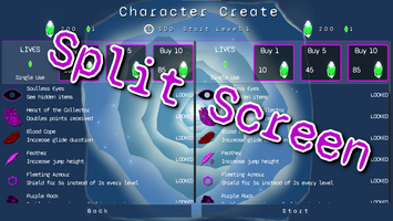
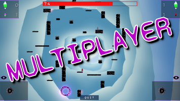
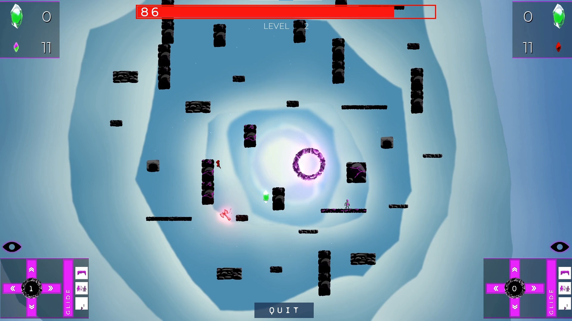
After removing the scattered rng.randomize() calls, I got I working in split screen, and over LAN using Godot high level networking framework, which is very simple to use. For online, I'm going to see if I can integrate steams lobby stuff. But that’s next month problem… Here’s a pic of split screen, which you can play in the demo!
Programming
And now for the best bit, the nerdy back end stuff that gets me up in the morning that nobody will ever see of care about! By the way, for context to the following, I’m using Godot.
And there are lots of it. Anyone who’s made a game before knows that when they start, they do all the things you aren’t supposed to do, just to get something out. Like copy/pasting code. Yes, we all do it. Well, I got rid of the lot. Probably halved the amount of code, and made some super fancy reusable game nodes. All the different ways you can play the game now are all wrapped up into a single node, with interchangeable parts. Fancy! Trust me.
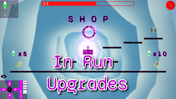
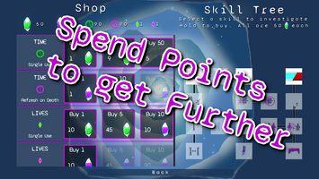
Another thing I really got to grips with were using the tool keyword to custom objects I’ve made, so changes show up in the editor. Super fun and leads to really nice reusable code you can drop into other projects. Its really enabled me to make some pretty impressive (IMO) menu bits and pieces. For instance, the whole of the shop is full of them:
Godot docs about tool: https://docs.godotengine.org/en/stable/tutorials/plugins/running_code_in_the_edi...
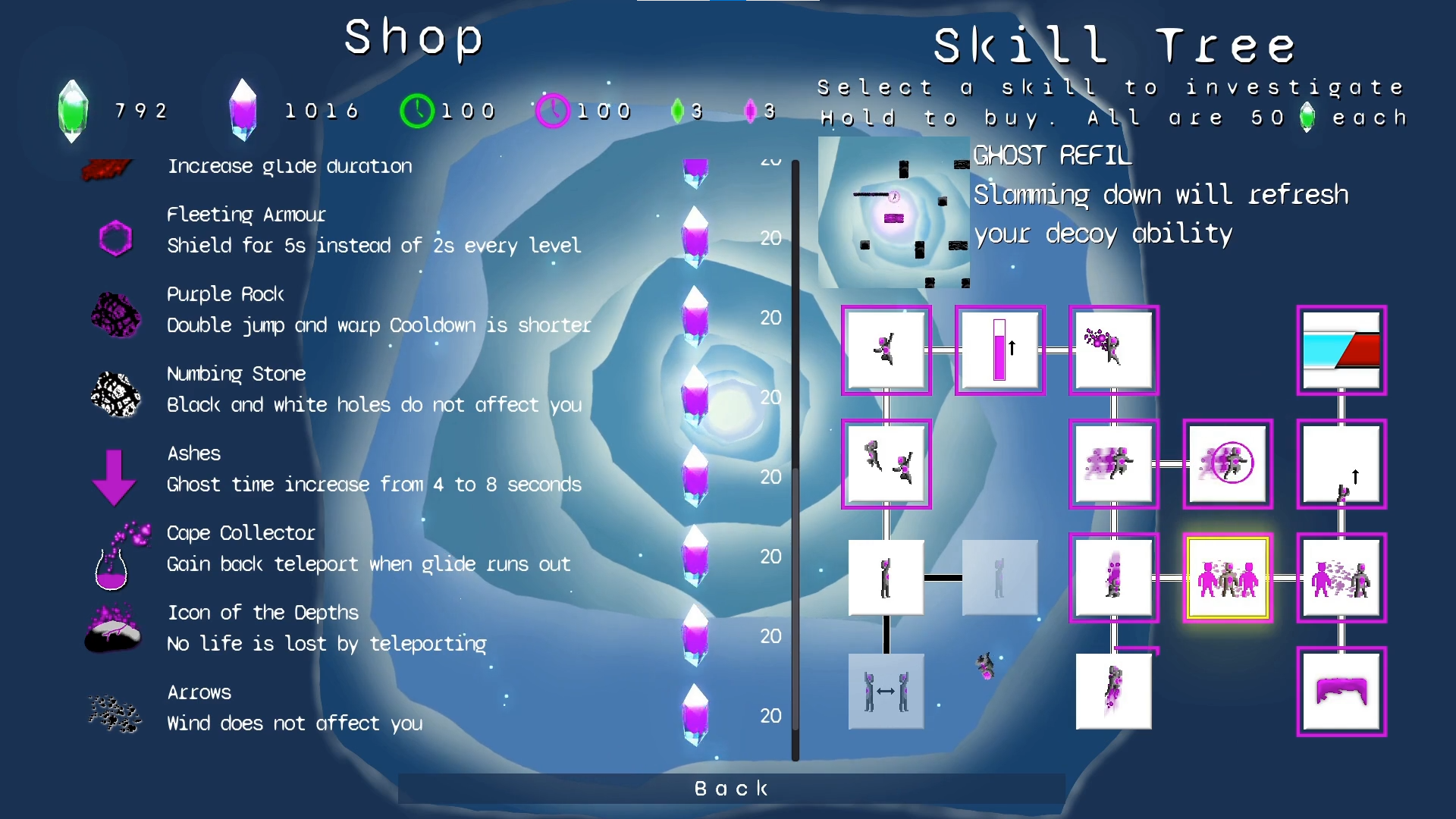
I’m thinking of making a GitHub repo with lots of reusable elements that people could use and add too. Let me know if you think this sounds like a good idea.
Game Over
And that's about it. If you got this far, thanks for taking in my ramblings, and I hope it wasn't a complete waste of your time. Be sure to check the demo out and let me know what you think. And if you have a game demo you want me to play, let me know! Always looking for the next Celeste!
Bye,
Boc
Files
Get Escape The Ether
Escape The Ether
The most intense platformer ever made
| Status | In development |
| Author | BOC Dev |
| Genre | Platformer |
| Tags | 2D, Casual, Fast-Paced, Multiplayer, Roguelite, Singleplayer, Speedrun, Split Screen, upgrades |
More posts
- ESCAPE THE ETHER FULL RELEASE OUT NOW!Jul 01, 2022
- Gearing up for first full release!May 29, 2022
- Updates to DemoMar 15, 2022

Leave a comment
Log in with itch.io to leave a comment.